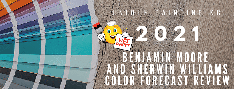
There was a little delay (probably because of COVID), but the decisions have been made and the wait is over. Finally, the color of the year and the 2021 Palettes are out for Sherwin Williams and Benjamin Moore. I’m always excited when October rolls around because I know these colors will be making their debut. Because we are right in the middle of the United States and the trends generally start on the coasts means there will always be a slight delay of appearance for these amazing colors. And to be honest, a few of these colors will never even grace our walls because, well, this is just a forecast, and forecasts are basically just educated guesses.
Benjamin Moore
Okay, let’s talk about color!! I’m going to start off with the Benjamin Moore’s 2021 Color Trends. Their Color Of The Year this year is…drumroll, please…Aegean Teal 2136-40!!! It’s no secret that I’m a Turquoise fan, and this soothing color hits the mark for me. It’s a warm, inviting color that truly soothes my soul. It reminds me of a soft pillow, ready to be napped on only this pillow isn’t reserved for the bedroom only. You can use this beauty throughout your entire home.
Director of Color Marketing and Development, Andrea Magno, says, “Each year, we invite homeowners to use the Color Trends palette as a point of inspiration to bring color into the home in new ways.” The colors in this 2021 palette, really bring the warmth and they all play so nicely together. I can definitely see myself bringing these colors into my home or offering them as suggestions for the homes of my clients. The reasoning behind this was to create comfort in the space we’re spending most of our time these days, home. The folks at Benjamin Moore want us to think about a simpler time, and revel in the simple things. The group of 12 colors that are highlighted this year for the 2021 palette are definitely the opposite of complicated. In my humble opinion though, BM Color Forecast Palettes never are complicated…they’re always keeping it simple.
Sherwin Williams
Now, on to Sherwin Williams. This past August, Sherwin Williams presented their 2021 Color Mix Forecast which consists of 4 palettes: Sanctuary, Encounter, Continuum, and Tapestry. Sherwin Williams has created these 4 palettes to celebrate the Rhythm of Color.
“We started telling a story last year about using color to help us feel grounded as we were headed into a new decade,” says Sue Wadden, director of color marketing at Sherwin-Williams. “Now we are continuing that inward journey by exploring the past, examining the present, and looking at what this all means for our future.” As we reexamine our country’s past, deal with the present pandemic, and plan for the “new normal,” Sherwin-Williams has chosen palettes that are all about rhythm and “the balance between fast and slow, quiet and expressive, and virtual and physical.”
Rhythm and Balance; now those are two things we all could use more of during a pandemic. So which colors can we expect to see painted on our walls in 2021? If Sherwin-Williams predictions hold true, “bold blues, muddy greens, muted reds, bright pinks, and warm whites” will be the colors of the moment.
Palette #1: Sanctuary
A return to nature is exactly what this low stress palette is all about. Most of us are currently focusing our entertainment budgets and weekend getaways toward hiking, camping, bike riding, gardening, and just spending time outdoors. “Rooted in the idea of nature, Sanctuary focuses on the connection that the natural world has to nurturing wellness and calm,” Sherwin-Williams explains.
Palette #2: Encounter
Who doesn’t feel a sense of calm when glancing at this palette? I see a lot of rich, earthy tones and natural materials, with a bohemian feel thrown in. This palette is all about “heirlooms and the stories behind them”, Sherwin-Williams says.
Color Palette #3: Continuum
With many folks working from home these days, thanks to the Covid, we can definitely see how technology has changed our home life in a big way. Technology and “Smart Living” are the basis for this beautiful palette.
Color Palette #4: Tapestry
And, because we can all get a touch burned out on earth tones and natures inspiration, voila!…they bust out this Tapestry color palette. Tapestry focuses on joy and creative expression. I love the vibrant hues this palette has going on, especially Jaipur Pink.
And finally, The Color Of The Year: Urbane Bronze SW7048. According to SherwinWilliams.com, this choice was based on being rooted in nature. Bringing the outdoors in and creating the ultimate retreat for reflection and renewal is of the extreme importance at this time. Urbane Bronze is a relaxed and comforting color that can really smack you with sneaky sophistication. I would use this warm, down-to-earth color as an accent for interiors and exteriors.
So, that’s what’s up with color for the year ahead from Benjamin Moore and Sherwin Williams. Which colors do you think you will incorporate into your own personal palette? Are there any colors you feel you would rather not know about? Just like all forms of art, these color palettes are subjective. Tell me what you think.
