
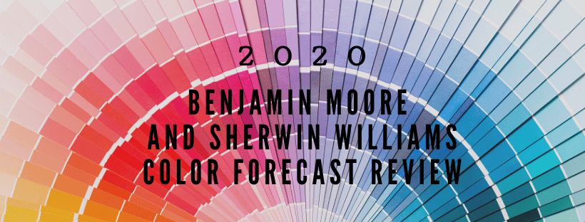
Benjamin Moore and Sherwin-William’s colors of the year are out! This is one of my favorite times of the year, y’all! I look forward to reviewing their color choices. I’m going to preach the same sermon I do every year: the colors they choose won’t make their way here for a minute, so we just have to be patient. We’re right in the middle of the USA and most of the trends tend to start on the coasts. In fact, the colors that were introduced in the color forecasts last year still aren’t quite on trend in the Midwest. But, in reality, these forecasted colors may never make it here. A forecast is defined as a prediction or estimate of future events. Being from Missouri, I can attest to the fact that forecasts can be totally off point. Of course, I’m talking about the weather, but a prediction is indeed, just a guess, however educated it may be.
So, let’s get started, shall we? I’m going to jump into the Benjamin Moore’s 2020 Color Trends. First, I want to introduce their Color Of The Year: First Light 2102-70. I always enjoy the names of paint colors and this one is so fitting for the color it represents. First Light…makes me think of the sun shining through my bedroom window, casting a pinkish, yellow glow across the room. This color is exactly that. A color that radiates optimism and goodness. I am a fan of this color for sure, if you can’t tell, and am thinking hard about where to put it in my home.

I have to say, that sermon I was preaching before, the one about color trends not reaching the Midwest right away? Well, this year’s palette blows that idea out of the water somewhat and I’ll tell you why in a minute. As a whole, this palette is understated, but packs a harmonious punch. I’m sold! Its soft selections are balanced with some strong, but not exactly bold, colors that create a zen-like feel. And, a selling point for me, is that there are only 10 colors in this palette. That’s all that is necessary, really. Selling point number two, is that I have used all the colors in this palette (at least some variation of) this year, which is why my theory about color trends not making it to the Midwest until later, has lost a little cred. This either means that I am on trend when giving color recommendations, the trends have arrived here in the Midwest faster than they normally do, or the colors chosen for their palette this year are more timeless. I love how this palette is not overcomplicated. It’s about the colors, and the person viewing the palette can create their own connections and create their own ideas of what influenced the color choices.

And now time for the Sherwin-Williams 2020 Colormix Forecast review. Each year Sherwin-Williams hosts an unveiling of their palette in several cities across the US. I have gone the last 3 years and look forward to it annually. They present the palettes and explain the inspirations behind each. They also give a little sneak peek for what they see trending in the next year. This year they have created 5 palettes, which they are naming, as a whole, Color in Balance. They’ve fashioned a mandala for each of the 5 palettes. A mandala represents completeness and self-unity and is always presented in the form of a circle, symbolizing balance. The 5 palettes are named Alive, Mantra, Play, Haven, and Heart.


Alive:
Influences: Optimism, Authenticity, Glocalization, New Local
This palette houses the color of the year which is Naval SW6244. It’s a timeless, nautical classic, that can be powerful on its own and also neutral enough to let other colors take center stage.
Alive is the richest of the 5 palettes. All of the colors are bold, but good team players, with Touch Of Sand SW9085, the neutral captain.

Mantra:
Influences: Minimalism, Serenity, Scandinese, Sanctuary
This palette is a warm balance of cool neutrals. It displays a sweet harmony of soothing hues at play. JOMO is a term they used to describe this palette at the event. FOMO is the Fear Of Missing Out. JOMO is the Joy Of Missing Out. The idea is that these softly muted neutrals will make you want to stay in and embrace the simplicity of home.

Play: Influences: Escapism, Humor, Joy, Energy
This palette celebrates individuality, with pink being the key color.
Play is my favorite palette of all. If I walked into a room and each of these palettes were people, I’d walk straight up to Play and introduce myself, because I know Play would tell the best jokes. It’s a high energy palette that screams fun. I’m always a fan of bright, unexpected pops of color in a room of neutrals and that’s exactly what Play is all about. The base for this palette is pure white, but sprinkles of pinks, golds, and turquoises bump the good times to the next level.

Haven: Influences: Simplicity, Wabi-Sabi, Conservation, Material Health
This palette is also influenced by water with key colors being in the green family.
Haven is a calm, earthy palette that pushes the color envelope but in a subtle way. This palette reminds me of the outdoors, touching on each of the elements of wind (does wind have a color?), trees, water, sun, sky, sand, and dirt. Haven brings these earthy elements indoors to be enjoyed by those who either have severe allergies and can’t go outside much or those that love the outdoors so much they want to feel like they’re outside always.

Heart: Influences: Bauhaus, Bohemian, Fusion, Humanity
This palette is all about travel, discovery, spreading tradition, and comfort. I would have to say that Heart is my least favorite palette, color wise, but holds some nostalgic weight in my heart for sure. The colors agree with each other and are warm and cozy. They remind me of a spice cake with coral icing, because that sounds delicious right now, but they also remind me of the orange clay beaches and green waters at the Lake of the Ozarks. They take me back to my childhood visits to my Grandma’s lake house and playing on the beach and in the water for hours. The clay beach, my sunburned skin, the faded redwood stain on the dock, the dark brown painted deck and trim, the muddy olive water, Coca-Cola, the froth on the waves washing up the beach, the leaves, the fish, the snakes…good times…good times.
So, there you have it folks. The color forecasts for the first year of our new decade from Benjamin Moore and Sherwin-Williams. Which palette struck a chord with you? Which would you have rather not been introduced to? These color palettes are a form of art and art is subjective. I’d love to hear your thoughts.
And, don’t forget, if you need help with Color Selections, Design, or Staging, give me a shout (816-500-7759).