
Hey, ya’ll! Last month I reviewed the Sherwin-Williams colormix forecast as well as the Benjamin Moore forecast for 2020. Some of you are probably wondering what is up with these forecasts. Why are they necessary, what are they for? Who actually decides which colors make up the palettes that set the forecast for the coming year? Well, let me give you a little background.
Color forecasting has been around since the early 1800’s. The oldest forecasting service in America is the Interiors Committee of The Color Association of the United States. Once a year, Interior Design experts from every aspect of home decor come together to create a palette. This palette is comprised of the predicted amazeball colors that will be enjoyed by all for the next two years. It sounds kind of impossible, presumptuous even, to predict the colors that everyone will be gaga over for the next two years, right? Until I learned exactly what goes in to choosing the colors, I thought it was a bit hokey too. However, you’d be surprised to know exactly how much science, research, consumer survey results, reports, and testing is involved and how POP culture, climate, news media, fashion, words, art, images, and so many other outlets are considered when creating a forecast. Actually, much genuine effort is given to this color guessing game. This palette helps manufacturers decide what home décor items to create so they’re available to the consumer at one time, while the look is hot, and the consumer can complete their décor vision in one fail swoop instead of waiting months for new items to arrive in stores. Color forecasting is actually a pretty fancy communication tool if you think about it.
Chad and I are not that fancy, or educated (at least Chad’s not;)) about POP culture, fashion, and all that business, but every fall, after Benjamin Moore and Sherwin-Williams come out with their color forecasts for the coming year, Chad and I put our heads together, in the van, and do a little color forecasting of our own. It’s always a good time, let me tell you. We talk about colors we like, colors we’ve used a lot of, colors we think are making a comeback, colors that we think are tired and played out, and colors we hope to see more of. That’s pretty much the basis for how we choose colors for our Unique Painting KC Color Palette. I’m so sorry if I’ve ruined your vision of us perusing consumer research and design reports while sipping lattes and delicately nibbling Chris Elbow chocolates in our faux fur, cheetah collared hoodies and Jackson Pollock inspired readers as we discuss the undertones of colors with names like Sulfer Yellow. That’s not us, ya’ll.
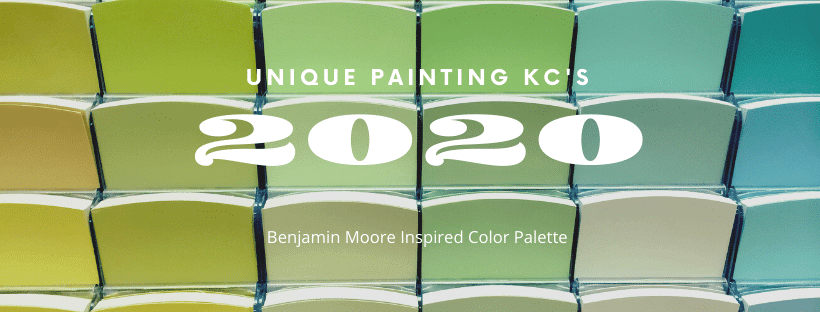
We use both Benjamin Moore and Sherwin-Williams paints and so we’ve chosen our favorites from each. This blog highlights our Benjamin Moore color palette.

Benjamin Moore:
The colors we put together for this palette are a fine group. First, let’s discuss the basics. These 5 colors are what I consider staples in our palette each year. We will always have our favorite White, Black, Brown, Navy, and Gray. So, let the introductions begin:
- Chantilly Lace OC-65. Another crisp, clean white. Chantilly lace is a refined beauty that we predict we will be seeing more of next year as an exterior color.
- Jet Black 2120-10. Our favorite Benjamin Moore black, that reminds me of actual charcoal, not the color charcoal. I say that because I don’t see any gray in Jet Black. I’d absolutely use this on an interior accent wall and it would look great on exterior windows.
- Bittersweet Chocolate 2114-10. We painted an exterior body Bittersweet Chocolate and oh, wow!…it turned out beautiful, stunning, in fact. I’d use this stun muffin as an accent color, but loved it as the center stage, body color as well.
- Old Navy 2063-10. Old Navy reminds me of a Royal Blue that is having a dark moment. It’s a brooding sailor full of attitude. Bold and pure, I would use Old Navy on an accent wall, in a dining room, or even in a small bathroom, but I think I’d use it just about anywhere.
- Pebble Beach 1597. This light as a feather, cool gray is a favorite for those who want a true gray, not greige. It’s classic and timeless. I see a hint of blue in Pebble Beach, but not enough to consider it a blue gray. I’d love to see this on a ceiling with Chantilly Lace as the wall color.
The rest of the colors on our palette are the sweet icing on your fav cupcake, the umbrella drinks at the party, the pretty stuff, ya’ll! They are as follows:
Boreal Forest AF-480, Bronzed Beige 2151-50, Proposal AF-260, Spearmint Ice 596, Shenandoah 684, White Chocolate OC-127, and Rhine River 689.
Individually these colors are all amazing, but I have a kitchen fantasy that I can’t kick and it involves three of these colors. Picture this: Boreal Forest lower cabinets, White Chocolate upper cabinets, and Proposal on the walls. I’m imagining this kitchen with copper or brass fixtures and hardware. Someday…someday.
White Chocolate is actually Chad’s nickname, one he wears proudly. He might’ve had something to do with this choice, maybe. It’s a creamy white that keeps popping up in exterior and interior projects.
Proposal reminds me of First Light, which is actually Benjamin Moore’s 2020 color of the year. It’s a sweet pinkish coral that resides in their Affinity collection as does Boreal Forest.
Boreal Forest has a nice gold undertone but is all about the green. Bronzed Beige is bringing back that gold we saw not too long ago, but this gold is back in a different light. I’d for sure not put this all over uninterrupted walls in an open floor plan, but I’d use it with Chantilly Lace or White Chocolate and Old Navy, even Jet Black.
Spearmint Ice is a warm pastel green that can go on any wall you want to use it on. I’d love to use it in a laundry room, bathroom, or bedroom. It’s definitely a classic.
Shenandoah is a gray green that would do any accent wall justice. It’s a cool classic that is calming and inspiring.
Rhine River and Shenandoah look like they could be brother and sister, but Rhine River is much less intense. It’s a much lighter green that has a touch of blue. I see this color in a bathroom or office. Like its bro Shenandoah, Rhine River is a calming color that will attempt to destress your life like a long walk on a cloudy day.
So, there you have it folks, our delightful dozen. These 12 colors are ones that we see being used around town in 2020. What do you think? Drop us a comment. Did we leave off your favorite? If we did, tell us what it is and why it’s your favorite.
And, don’t forget, if you need help with Color Selections, Design, or Staging, give me a shout (816-500-7759)!