Ahhh…pastels. I remember the first time I visited my grandmother’s house. I was 4 years old and I thought she had the most beautiful house in the world. It was a ranch style home built in the 60’s and it was filled with pastel colors. The entry and hallway were green, the living room was white, dining room was orange, the kitchen was yellow. My grandma’s bedroom was also green, there was a blue guest room, and the hall bathroom was turquoise and pink. I was so in love with all of those pastel colors! I am pretty sure that visit ignited my passion for color and design.
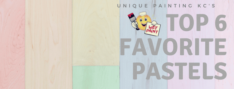
Pastels are not just forgotten colors of the past though. The popularity of millennial pink has made us all take a second glance at the pastel palette. Soft muted colors are a big thing right now and probably will be for the next year or so. This seems to happen right before bright bold colors make their way to the stage. I am not usually a fan of pastels, but I am enjoying these gray scale softies quite a bit. I like how they can brighten up and enlarge a space while adding just a tinge of color. They let the “stuff” in your room take the spotlight but are definitely the backup singers that complete the composition.
Here are our favorite pastels of 2020:
Intimate White SW6322
Intimate white is one of those pinks that make me think of soft cotton sheets. I don’t know why! It, like all of the colors in this palette, is just barely there. It’s a sweet rose that brings the sunny, as most pastels will. Of course, the first place I think of for using this put me to sleep color is a little girl or baby’s bedroom
Embellished Blue SW6749
This is a pretty one! Like the lightest, most airy turquoise you could ever imagine. Embellished Blue is the perfect bathroom, kitchen, bedroom, laundry room…color in the land, IF you like turquoise. I’m obviously a big fan! LOL! Since I live in the middle of the United States, I have to be creative about how to bring the ocean to me.
White Mint SW6441
Believe it or not, we just painted an exterior body (with white trim) this color recently. It was one of several houses on a large property, all of which were painted a variety of pastel colors. I did not choose the color and was frankly not too excited about the impending outcome. BUT, It turned out way better than I thought. It’s the palest of pale when it comes to mint green, almost white, but with a touch of green thrown in to soften the glow. It would be a welcoming interior color in a kitchen, bedroom, or bath.
Spatial White SW6259
Sky High SW6504
We have used this color on a couple of large front porch ceilings. I am a big fan of blue front porch ceilings, by the way. Sky High is not a bold blue by any means. It is a soft blue and can make any porch ceiling look like an extension of the sky. I would use this blue in a bathroom, for sure, or a bedroom. I would even use Sky High to upcycle a piece of furniture.
Faint Coral SW6328
Faint Coral is the sister from another mister to Benjamin Moore’s color of the year, First Light. It’s such a beautiful pink, but just a touch. We recently painted a craft room for a client Faint Coral. The homeowner said she felt inspired and loved how it set off all of the artwork and projects she has on the walls and displayed around the room. I swear I am going to use this color somewhere in my home as soon as I get an extra couple of hours to paint (I’ve been saying this for 6 months, but it will happen!).
There are so many pastels to choose from, but these are our favorites. They all have different undertones and just as you choose any color for the interior of your home, choosing the right pastel depends on your furnishings and items you do not plan to change (flooring, tile, interior trim color, countertops, etc.), how the sunlight works in the room being painted, and how you want the room to feel (warm, cool, dark, bright).
For exterior, choosing the right pastel is also about making sure the color you choose jives with your roof, landscaping, windows, any stone or brick you may have on your house, style of your home, the area in which you live, and even paying attention to the color of your neighbor’s homes. Whether you’re choosing interior or exterior colors, taking the time to grab a sample is not a terrible idea, I would recommend it if you’re struggling and even if you’re not. Seeing the color in its element will give you some peace of mind.
And if you’re still having a hard time choosing the right pastel, I’m just a phone call away (816-500-7759).
