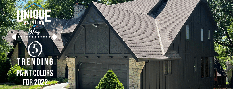
Choosing a color scheme that matches your home, deciding on a finish, and considering natural light can be an overwhelming process.
Whether you are trying to achieve a bright and airy or warm and cozy space, the right hue can help you accomplish your vision. Our color expert has chosen five colors that are trending right now to help get you started.
Alabaster (SW7008)
This hue has been a fan favorite since it was the color of the year in 2016.
Its versatility to be paired with other calming neutrals, or ability to assist brighter shades, makes it an easy choice for just about any part of your home’s interior or exterior.
Tap into its tranquil, meditative properties by sweeping it across your bedroom or nursery. Use it to join transitional and traditional styles by matching it with blushes or grays. Or, use it alongside darker hues to create a balanced contrast for your bathroom or office.
Coastal Plain (SW6192)
Utilizing muted colors like this is an easy way to incorporate color into your home without overwhelming it.
This muted green is delicate enough to be used on your home’s interior trim and doors and forward enough to use as a subtle, bold color in your bathroom or dining room.
This color compliments grays, creams, and most other refined earth tones.
Black Fox (SW7020)
Don’t let the name fool you; while this deep, saturated shade is named ‘black,’ the rich brown undertones of this color make it more adaptable for all your interior and exterior spaces.
Brown undertones tend to read more warm and elegant. Deep colors like this one appeal best to homeowners trying to achieve a more modern look.
This hue is an excellent choice as an interior or exterior trim color when paired with lighter shades. Use it as the body of your home’s exterior when paired with a darker, more true black trim color.
Iron Ore (SW7069)
This is the color for you if you are looking for a bold statement. Most of the time, a true black appears too stark. This charcoal color can read as a true black but is soft enough to pair with other neutrals to achieve a natural feel.
This color is often used as a home’s exterior trim color when paired with lighter hues, or the primary paint color when paired with other natural elements such as wood and soft landscapes.
The depth of this color choice makes it a front runner for an accent wall on your home’s interior to create a dramatic focal point.
Repose Gray (SW7015)
The perfect ‘greige’ does exist! This is an ideal neutral for virtually any decor style.
Have you ever painted a room gray only to notice that it has a purple or blue hue? Not to fear, this shade has a taupe base that eliminates that issue.
You can use this color anywhere, and it has been a popular choice as the primary color for a home’s exterior and interior alike. Wherever you put it and however you use it, you will find it leaves a crisp and clean space.
Our color expert, Toska, will help you achieve whatever aesthetic you are dreaming of for your home’s interior or exterior. She will walk you through a color consult to take the guesswork out of finding a color you are sure to love and one that compliments your home.
