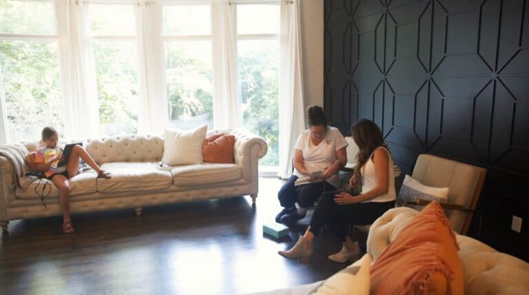
A new year always brings a chance to renew and refresh. This winter’s most sought-after colors range from bright and airy to rich and moody. Whatever your taste, there is something for you.
Here are a few colors to look for this year.
Vogue Green (SW0065)
While many variations of green are on-trend right now, this medium-dark hue will add a richness to your home that is timeless.
As a part of the Sherwin Williams historic paint pallet, it’s a dependable color that can be added to almost any home style. Try using this color in a room with classic elements such as different wood tones or brass.
Glitzy Gold (SW6691)
Winter’s grey skies might have you hoping for warmer and brighter days. This golden hue provides enough brightness to be uplifting and the perfect amount of warmth to be both lavish and modern.
Cabbage Rose (SW7620)
Mauve has made a modern comeback. From pillows and shelf décor to remove flooding your walls, mauve is here for 2022.
Choosing the right shade of mauve can be tricky – stay away from shades that are too violet or too grey. We’re here for the muted mauve; something a little more on the neutral side. Pairing this color with warm beige pieces such as pillows, throws, or even a sofa will create a luxurious feel.
Irish Cream (SW7537)
Have a dull or dark room in your home? Warm whites are always a safe choice, bringing brightness without being too stark. This versatile color can be used throughout your entire home, kitchen cabinets, or bathroom vanities.
Seaworthy (SW7620)
It is clear green is having a moment this year, from bright Kelly green to deep turquoise.
With its navy-blue appearance and green undertones, this hue of green is calming and welcoming. It’s an excellent backdrop to a living room or any part of your home with large windows and plenty of light.
Blackberry (SW7577)
Creating a moody space doesn’t always mean dark greys and blues. There is a reason this color made the HGTV Home color pallet. It’s rich but not overwhelming. Make a statement by using it to paint the trim or even the ceiling.
Raging Sea (SW6474)
Incorporate the peacefulness of nature into your home using this green turquoise. Combining grey elements will provide an elegant space for an ideal dining room. By adding other natural features such as wood tones and darker shades of blue, you can create a relaxed and refreshing feel.
Almond Roca (SW9105)
We are always going to need soft neutrals for balance. Creams and tans are this year’s choice for doing so. This caramel tan swept onto a central wall in your home provides a cozy neutral starting point for decorating any room.
From crisp and clean to dark and moody, the paint you choose sets the tone for every room in your space. We’d love to guide you through the process of re-designing or painting your home. Call us at 816.500.7759 or visit our website to get started.


